As the founding editor of Lawrence & Gibson publishing collective, I’ve bound about 14000 books in my life. Our collective hand makes books in a little office in central Wellington. We’re nineteen years in and have thirty-two titles to our credit.
When I say I hand-make books, people immediately think of industrial revolution-era machines with stitched bindings and offset plates. Not so! Nor are we the new school of fully automated print on demand. We have a printer, two guillotines a binding machine and a crimper. Our technology is slightly out of date — all the equipment is second-hand and was acquired at bargain-basement prices.
I’ve made some damn ugly books in my time, and I am not talking about the aesthetics of the cover. I mean lopsided, under- and over-glued and with skewwhiff margins. As with any manufacturing, the trick is not letting anyone other than your own team see the mistakes. In this time, I have learned a little bit about the process. I want to share some of these thoughts because so many people have so much love for books and perhaps some material understanding of the paper and the binding process may sharpen that understanding and that love.
I am also aware that I am a little bit of an amateur in the world of commercial book-binding. The division of labour between a publisher and a printer is stark and I don’t think there ever was a simpler time when they were one and the same. Perhaps they are only out of necessity: underground presses being literally underground … have you seen the means the pre-Soviet communists or the Soviet-era liberals went to hide their operations? Wells, basements, tunnels and caves: that’s what it means to be underground.
Here are some things that not everyone knows about books.
1. Paper has a grain
This is the simplest of the lessons of a book and one of the most consequential for the reading experience. In the manufacturing of paper from wood pulp, the fibres of the paper are all pushed in one direction. This direction of the grain needs to be recorded because it is not always obvious. The normal format is for the grain to travel from bottom to top on a page held in portrait. This is called long grain, as the page is grain follows the longer edge. Short grain, as one might expect, is when the paper fibres travel from the bottom to the top on a page when held in landscape view.
One way to tell which direction your paper grain goes is to rip a page: if your rip from top to bottom follows a more or less straight line, then it is more likely to be long grain. If the rip is irregular, zig-zagging, then you are likely to have short grain paper. If you’ve ever had experience splitting wood, a similar logic applies: it makes for a much cleaner cut to split wood along the grain than against it.
The tearing of paper is not a full-proof method, however, especially for people unfamiliar with what to look for. Another, less barbaric method is to test how easily the page curls. If the grain is long, then it is easier to curl it when held vertically compared to horizontally.
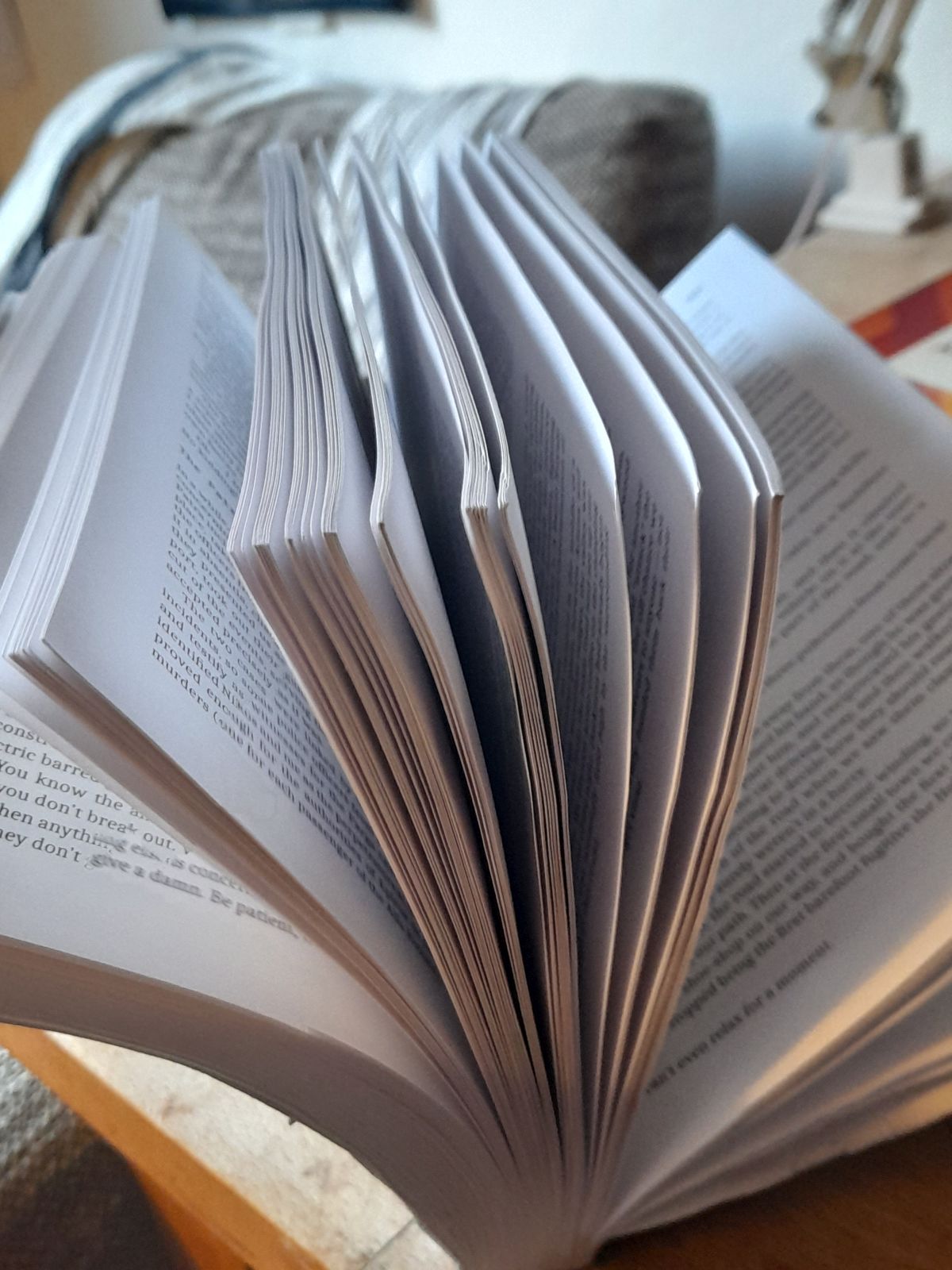
Every book should be bound in the same direction, since the grain runs so that the pages more naturally curve as you splay them. I’m currently reading a novel that is bound against the grain and the pages give a lot of resistance when I try to hold the book open and turn them. Instead of the lovely curl of pages, holding the book open produces more of a V.

You may well have read books that you have fought to hold the pages open, unsure why the experience was less straightforward than usual. This most often happens with small binders — like us! — who acquire paper in all sorts of manners and don’t think about the direction of the paper’s grain.
One of the most common mistakes for new binders is to make an A5 book by printing two on a standard A4 printer paper. But because the grain is long on the A4, it will be short on the A5.
The paper in our collective’s first run of our second book had the paper grain going in the wrong direction. At that point I knew nothing about grains, and just thought that something weird was going on with the paper itself, or perhaps the binding. It was only when the book was opened halfway through that the pressure really made itself known, cracking the glue on the spine.
2. The spine is a fulcrum
There’s something so metaphysical about the way books affect us that sometimes we completely overlook their physics and mechanics. So often we think of a book as the meaning, the story, characters or facts within. But other than a repository of knowledge, a book is also a material thing. When we open a book, we apply the power of a lever on the spine: when the paper grain is in the correct direction, the page curls and very little pressure is exerted on the spine. When the grain does not allow an easy curl, more of the leverage goes onto the glue of the spine. The spine functions as a fulcrum: each page is a load and a book is a class-two lever, like a car door.
Publishers try to make the spine as strong as possible. The notcher is a device used to strengthen the spine, by coarsening a block of pages before the glue is applied, increasing the area and number of fibres that are exposed to the glue. The more surface area covered by the glue, the more space the glue has to hold onto and the less likely it is to break when pressure is exerted on it.
Think of a book made of heavy cardboard that won’t bend and will, instead, crack the page out of the spine. The reader uses the power of leverage from the outside of the page to break the book at the fulcrum. The flexibility of the page lowers the pressure on the spine.
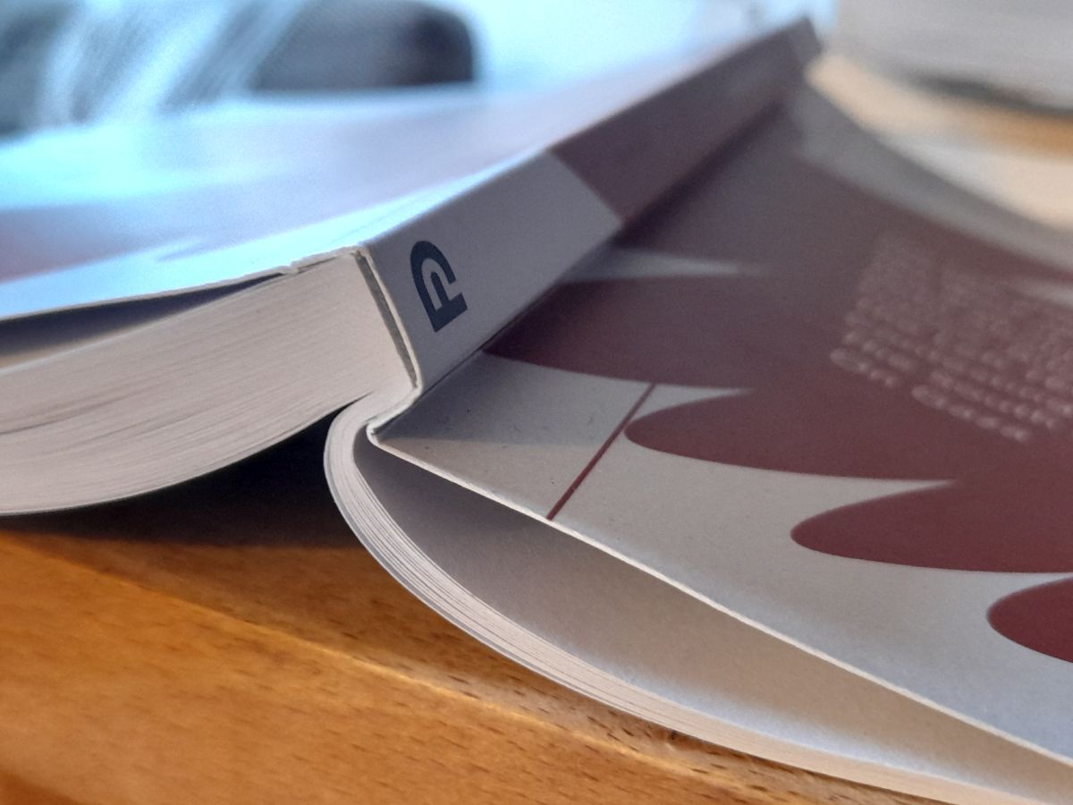
Another device used in the trade is the crimper. The crimper places a line on the book cover that guides the reader to bend the book there, and not at the spine. Whenever I get a new book, I open it deliberately at the crimped line, then bend the first three pages at that point. These folded-over pages will take the pressure off of the point where the first page meets the spine and where glue is most likely to crack.

3. The spine may be pre-emptively convex
This final observation of mine is somewhat speculative.
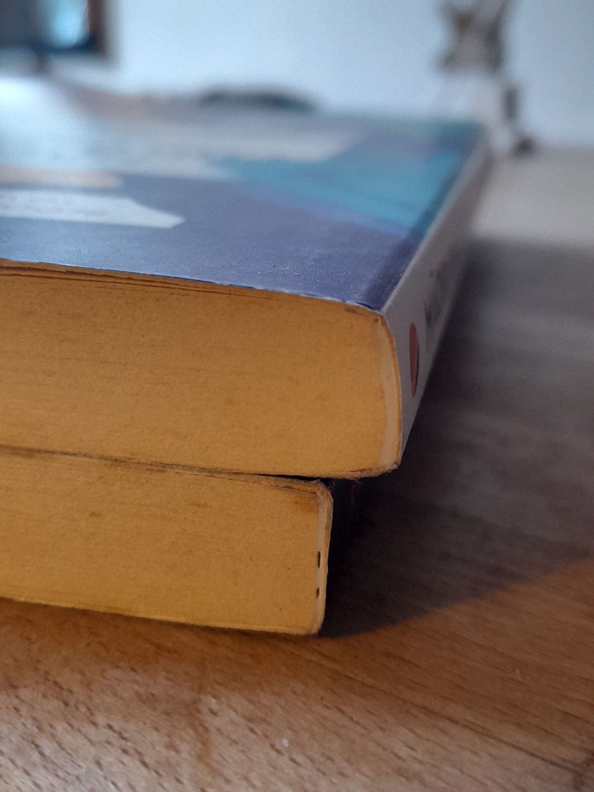
The natural tendency of a spine on a well-read book is to become concave: look at any well-thumbed paperback on your shelf and you will see that, if the spine hasn’t cracked, the spine will usually appear convex. This makes sense if we think of all the pressure on the spine as a fulcrum — given enough page-turning, it is likely that the glue will permanently curve under that pressure.
In recent years, I have noticed that the spines of new books often appear convex. I’m not talking about the lovely convex curve of a hardback, but an actual inbuilt curve to the glue that binds the book. This makes me wonder if bookbinders have begun to pre-empt the leverage exerted on a book.

Have a look at the newer books on your shelf and see if you can find a spine which looks like the centre of the spine is further out from the edges. I can spot a few on my own shelf and am unsure as to whether this is an aesthetic choice: maybe it is just that the spine looks less harsh and more welcoming as it bulges outwards? Or, as I have speculated, there is a structural aspect to the binding that is intended to give the book a longer life.
But how would such a convex book even get made? At our press, the pages are clamped into the binder, flat against a flat surface. They are notched, run across a rotating glue barrel, covering the spine, and then the glued pages come to rest above the cover. I then pull a lever which raises the cover to meet the glue-covered spine, while a block comes into place to ensure the squareness of the spine. With our machine the spine is square. I can’t quite imagine how the newer machines would create a convex spine but I am sure it is technically possible. And the evidence from my bookshelf indicates something like this is happening. There are a lot of people talking about spines on the internet, but I couldn’t confirm whether this is an actual practice.
*
Highlighting the materiality of the book goes against almost every book-designer’s instinct. It is oft-spoken as the sign of good design when — other than for a flourish or two — the reader does not notice the font, margins or any other physical aspect of a book.
The book is worshipped as an entity in and of itself. It is something of a paradox for these book-objects to at once impart information and spark imagination but also produce the height of commodity fetishism. Books are collected, ordered and praised even outside of the ideas that each book might impart. And yet, as with all commodity fetishism, we obscure the work that goes in to making the object. As a writer and a publisher I am wary of the fetishisation of the book as an object. I am wary of how it promotes surface-level marketing and diminishes the best thing that an author can offer: depth. I have seen too many embossed covers and one-word reviews that over promise and under deliver. It isn’t just readers who fetishise the book: authors often post pictures to Instagram of themselves receiving their new book in the post as if it were delivered by a stork and not by the labour of a printer.
And so my goal with delving into these aspects of the binding process has been to have the reader take a closer look at the pages in front of them. If we are going to worship the book as an object, then let us worship it as it really is. Let us turn the pages gently, enjoy the bend of a vertical grain as it deserves to and see the book as one object among many where the labour of the writer meets the labour of the printer and publisher.
Image: Robert Anasch


