In his famous 1984 essay ‘Postmodernism and Consumer Society’, Fredric Jameson analyses what he describes as a ‘full-blown postmodern building’—the Los Angeles Westin Bonaventure, designed by John Portman and built in 1976. In his critique, Jameson remarks on the confusing entryways which dislocate the building from the rest of the city, the ‘glass skin’ which encases the exterior and ‘repels the city outside’, and the escalators and elevators which designate and enforce new modes of movement. More than simply an aesthetic critique, however, Jameson’s concern lies in the general impossibility to gather one’s bearings in the space, the atrium’s grand scale with rising balconies above and miniature lake below prohibiting any clear perception of depth and volume. The spatial arrangement of the building not only formalises the kind of ‘suppression of depth’ typically seen in postmodern paintings or literature, but is what he calls a ‘hyperspace’—a space that transcends human’s perceptual equipment. For Jameson, this building stands as a kind of allegory of the broader dilemma in contemporary life, where the human capacity to ‘map cognitively its position in a mappable world’ is compromised in an increasingly decentralised, fragmented and globalised society.
When I first walked through the New Student Precinct at The University of Melbourne, I couldn’t help but recall Jameson’s analysis of the Bonaventure Hotel. Aside from the fact that the exterior of one of the buildings in the precinct, the Arts and Cultural Building, was in some ways reminiscent of the Bonaventure’s interior—both feature oval-shaped balconies that irregularly jut out from the different levels of the structure, and both juxtapose sensuous, organic lines with industrial materials like concrete and steel—it was more the feeling I had when I walked through the space that conjured up Jameson’s critique. The feeling could be described as alienation, a loss of bodily coordinates, and the overwhelming sense that this wasn’t really a space made with students in mind. Instead, it was a neoliberal ‘hyperspace’, where a student body is swapped out for a ‘hypercrowd’, where the dominance of ground-floor retail spaces feels eerily ‘exit-through-the-gift-shop’, and where architectural ostentation is primarily a grand advertisement for the university’s prestige and importance.
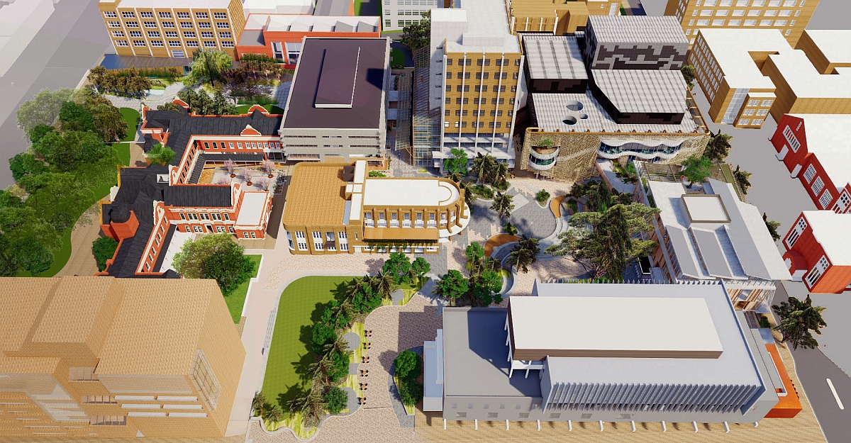
The New Student Precinct is part of a $229 million project that comprises the Student Pavilion, Arts and Cultural Building, the upgrade of several surrounding buildings, and extensive landscaping work. Completed in collaboration with a number of architecture firms led by Lyons (including Koning Eizenberg Architecture, NMBW Architecture, Studio, Greenway Architects, Architects EAT, Aspect Studios and Glas Urban), the design was supposedly informed through consultation with students, staff and alumni, and—according to the university website—has a particular emphasis on sustainability, accessibility and First Nations representation.
There are certainly good, functional elements of this new precinct—the surrounding ground was re-levelled and uses ramps to ensure accessibility for students of all abilities, there are ample areas for reheating food or washing stations to cut down on single-use plastics, and the toilet facilities seem to cater to the needs of the university’s diverse study cohort. However, it’s hard to parse the claims that the precinct was built with students in mind with the fact that there is so much that is dysfunctional about it, not only in terms of its design, but what the design symbolises.
For example, in 2021 the University of Melbourne scored the lowest in the country in The Student Experience Survey, with a 63.1 per cent overall positive approval rating. Meanwhile, the vice-chancellor was the highest paid in the country, and took home an annual salary of over $1.5 million. Against a backdrop of staff continually campaigning for better, more secure working conditions, where student experience counts for less, and where top management continue to profit at the expense of the quality of education and the university’s workers, these new buildings became allegorical for the broader conditions of higher education in Australia today.
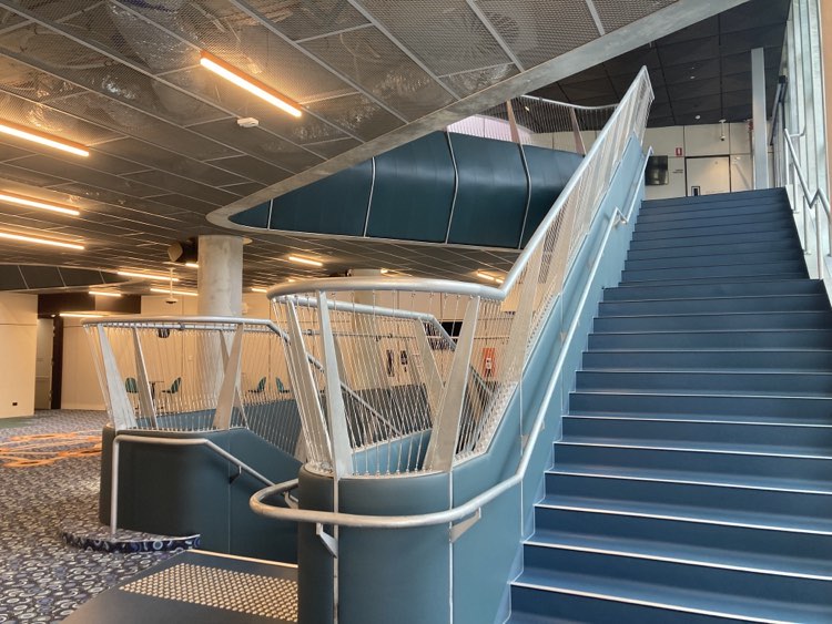
The experience of walking through the Arts and Cultural Building can only be described as assault of colour, texture and sound, where an uneasy conflation of references and styles meant that each element vies for attention in the most clawing, distracting way. The building’s interior is marked out by designated channels of movement: escalators are to one side, the central elevator stands in the middle, and quasi-Escherian staircases with high, steel railings open into an interminable flow of walkways which loop through the space, escaping onto balconies outside, winding through so-called study spaces or, on some levels, leading out to raised walkways that access neighbouring buildings. Each floor features circular internal balconies connecting it to the floors above and eventually reaching towards the skylights on the roof. However, this not only creates a strange suppression of depth—each floor seems to collapse in on the other—but makes it impossible to gather one’s bearings. As Jameson noted about the Bonaventure, this struck me as a ‘vengeance this space takes on those who still seek to walk through it.’
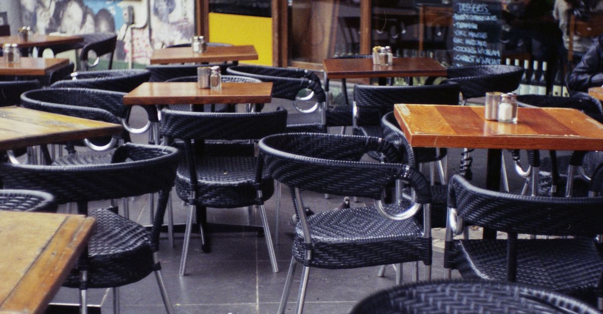
Borderless and open, the study spaces are perhaps the most egregious element of the entire design. The disordered arrangement of plastic chairs, backless stools or small oval desks inspire only the briefest, most transient moment of study or interaction. Despite their attempt to appeal to all students and cater to a multitude of student activities, they have instead made a space for no one and nothing. The design of this space instead felt governed by a specific idea of the modern student—the mobile, transient and unfixed student who revels in a space of interaction, whose work is collaborative not singular, and whose attention is both fixated yet fleeting. According to the Victorian Architecture Award body who recently awarded the New Student Precinct with the state’s most prestigious prize, the Victorian Architecture Medal, this was perhaps the exact kind of student that they had in mind. When describing the merits of the space, they say:
It is this permeability that de-emphasises the private, offering a sense of vicarious learning and participation in the endeavors throughout.
There is a distinct paradox at the heart of this kind of design approach. In so explicitly striving for ‘permeability’, for making a flexible space that is open to student possibilities and ‘endeavors’, whatever they may be, they have in fact even more clearly designated the rules for how these spaces must be used. These spaces, in being so decidedly open and permeable, are not just a ‘de-emphasis’ of the private, but a prohibition of the private. Consistent with Jameson’s identification of a ‘hyperspace’ in which spatial organisation outpaces human perception, the design of this building seems to transcend the conditions actually required for student learning. As a student, I want to argue that the intrusive nature of the design and the constant assertion of its presence means that human faculties are so consumed by processing all the architectural stuff that one can hardly concentrate. As Jean Baudrillard wrote of postmodern society, the design of this space is a kind of ‘forced extroversion of all interiority,’ where the creative innovation of its design actually casts a shadow over human potential.
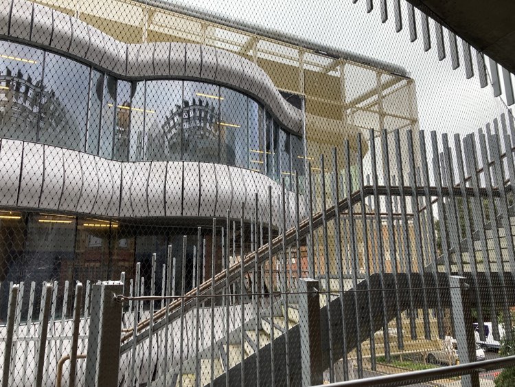
The sense of confusion and entrapment I felt walking through the building was unfortunately matched by the exterior of both the Arts and Cultural Building as well as the Student Pavilion (above). Wrapped in what the architects call ‘social cladding’, the Student Pavilion has a metal netting which extends around the entire building, generating an uncomfortable sense of imprisonment. Given that this netting encases the balconies on each level, I couldn’t help but be reminded of a suicide barrier. ‘Social cladding’ then seems more like a dark euphemism which somehow does get to the heart of what it means to be a student at a university today, where the cost of education continues to rise, student loans are indexed to inflation, and student debt is increasingly difficult to pay off. In lieu of any real support for student alienation, anxiety or financial stress, these grand architectures will supposedly catch you when you fall.
But perhaps the most symbolic element of the New Student Precinct is the deracinated Student Union. Where previously it stood in Union House (which, while now gutted, once functioned as the student hub), the union has now been moved to the inconspicuously named and difficult to find ‘Building 168’.
Entering the building on the ground floor is like entering a near-vacant foyer. At one entrance to the east of the building, you’re greeted by elevators and tall wooden tables on wheels with high stools, furniture that feels more like it’s merely filling out the space rather than performing any function. From the northern ground floor entrance, it’s just an empty, low-ceilinged walkway, with toilets to your left, vending machines to your right, and, a little way ahead, the Malaysian food chain restaurant PappaRich. Aside from the directory in front of the elevators, there’s no signage to indicate that this building houses what was once a thriving Student Union.
Since the Liberal Government’s abolishment of compulsory student union fees in 2005—a decision that was inspired by ‘freedom of choice’—it makes sense that union engagement and involvement has taken a turn for the worse. But the complete dropping of ‘union’ from the name makes even clearer the neoliberal design approach—rather than Union House, this ‘student precinct’ does not service a politicised, engaged student cohort who are represented by elected student officials, but a random group of atomized consumers. The term ‘precinct’ is therefore meaningful, carrying with it a kind of generic quality that is reminiscent of other ‘precincts’ in Melbourne, like the Docklands Business Precinct, or Chadstone Shopping Precinct. In other words, the experience of being a university student is collapsed into the experience of being a worker or consumer.
The new precinct, along with the awards it received, marks what is becoming overwhelmingly clear about Australia’s university model: prestige and outward appearance count for more than the quality of education for students, and certainly takes precedence over ensuring fair and secure conditions for those who work in these institutions. It is therefore not so much the aesthetic or design of the building itself, but that—like the Bonaventure Hotel—it reflects something more pernicious that lies at the heart of higher education: a hollowing out of the system. This is an emptiness that on the one hand speaks to what Ernst Bloch described as the ‘hollow spaces of capitalism’—like the Arts and Cultural Building, these feel like spaces of dis-use, where real student community, learning and intellectual inquiry are evicted in favour of the meaningless pursuit of accolades and profit. But this void also provides an effective echo chamber for university management, where a constant reverberation of internal self-congratulations, awards and prestige effectively mutes any student or union voice.
